Day of Defeat

Day of Defeat

Not enough ratings
Original WON menus for Day of Defeat
By sensei 黒いバラ
A collection of original menu styles from WON (World Opponent Network) era with the same fonts, colors and almost the same effects recreated by me specifically for Day of Defeat.
   
Award
Favorite
Favorited
Unfavorite
Introduction
As you all know, Valve had released a big update for Half-Life last year in honor of game's 25th anniversary. If you ask me, it's amazing of them not forgetting their golden title and giving it much deserved treatment.
I was especially excited for an unexpected return of original iconic menu from WON era, but, unfortunately, Day of Defeat didn't get one, so I've decided to recreate it myself.
At first, in April this year, I did it entirely for myself as a little hobby project, but recently I've thought that it would be good to share with everyone, so oldschool Day of Defeat fans and WON era/style connoisseurs could also have an opportunity to enjoy it.
Day of Defeat Alpha v0.5 (at the time known as "War in Europe")
Here is a bunch of screenshots, which will show you what I was able to achieve:

1. Original WON menu (click on it to open a full image)


2. My recreated version for low resolutions (click on it to open a full image) — optimized for 800x600 and lower resolutions, original screenshot resolution is 640x480


3. My recreated version for high resolutions (click on it to open a full image) — optimized for 1024x768 and ANY higher resolution (even 4K, all the elements will scale, except for background), original screenshot resolution is 1280x720

Day of Defeat Alpha v2.0 (at the time known as "War in Europe")

1. Original WON menu (click on it to open a full image)


2. My recreated version for low resolutions (click on it to open a full image) — optimized for 800x600 and lower resolutions, original screenshot resolution is 640x480


3. My recreated version for high resolutions (click on it to open a full image) — optimized for 1024x768 and ANY higher resolution (even 4K, all the elements will scale, except for background), original screenshot resolution is 1280x720

Day of Defeat Alpha v3.0 (at the time known as "War in Europe")

1. Original WON menu (click on it to open a full image)


2. My recreated version for low resolutions (click on it to open a full image) — optimized for 800x600 and lower resolutions, original screenshot resolution is 640x480


3. My recreated version for high resolutions (click on it to open a full image) — optimized for 1024x768 and ANY higher resolution (even 4K, all the elements will scale, except for background), original screenshot resolution is 1280x720

Day of Defeat Alpha v6.8

1. Original WON menu (click on it to open a full image)


Version with original white glow

2. My recreated version for low resolutions (click on it to open a full image) — optimized for 800x600 and lower resolutions, original screenshot resolution is 640x480


3. My recreated version for high resolutions (click on it to open a full image) — optimized for 1024x768 and ANY higher resolution (even 4K, all the elements will scale, except for background), original screenshot resolution is 1280x720


Version with yellow glow, which in original WON menu is used as secondary effect, when you click on any menu option

2.1 My recreated version for low resolutions (click on it to open a full image) — optimized for 800x600 and lower resolutions, original screenshot resolution is 640x480


3.1 My recreated version for high resolutions (click on it to open a full image) — optimized for 1024x768 and ANY higher resolution (even 4K, all the elements will scale, except for background), original screenshot resolution is 1280x720

Day of Defeat Beta v1.0 — 1.3b

1. Original WON menu (click on it to open a full image)


Version with original white glow

2. My recreated version for low resolutions (click on it to open a full image) — optimized for 800x600 and lower resolutions, original screenshot resolution is 640x480


3. My recreated version for high resolutions (click on it to open a full image) — optimized for 1024x768 and ANY higher resolution (even 4K, all the elements will scale, except for background), original screenshot resolution is 1280x720


Version with yellow glow, which in original WON menu is used as secondary effect, when you click on any menu option

2.1 My recreated version for low resolutions (click on it to open a full image) — optimized for 800x600 and lower resolutions, original screenshot resolution is 640x480


3.1 My recreated version for high resolutions (click on it to open a full image) — optimized for 1024x768 and ANY higher resolution (even 4K, all the elements will scale, except for background), original screenshot resolution is 1280x720

Day of Defeat Beta v2.0 — 3.1

1. Original WON menu (click on it to open a full image)


2. My recreated version for low resolutions (click on it to open a full image) — optimized for 800x600 and lower resolutions, original screenshot resolution is 640x480


3. My recreated version for high resolutions (click on it to open a full image) — optimized for 1024x768 and ANY higher resolution (even 4K, all the elements will scale, except for background), original screenshot resolution is 1280x720

Day of Defeat Retail v1.0

1. Original WON menu (click on it to open a full image)


2. My recreated version for low resolutions (click on it to open a full image) — optimized for 800x600 and lower resolutions, original screenshot resolution is 640x480


3. My recreated version for high resolutions (click on it to open a full image) — optimized for 1024x768 and ANY higher resolution (even 4K, all the elements will scale, except for background), original screenshot resolution is 1280x720

Download links and installation
You can download it from my Google Drive[drive.google.com]and Mediafire[t.ly]
If you, for some reason, don't want to use short URL or it will stop working, then you can copy a direct link to download page on Mediafire (remove the space before "com"): mediafire. com/file/pdub1ix0nytwjfj/Original_WON_menus_for_Day_of_Defeat.rar

Note: If you're worried about VAC ban - there's no point for that, because this modification includes only edited text files and images, which don't even replace original files, you can check it by yourself for more reassurance.

Installation is very easy:

1. Open your Half-Life directory, which is located in "Steam\steamapps\common", or go to your Steam library, press Right Mouse Button on Half-Life or Day of Defeat, hover your cursor on "Manage" and click on "Browse local files".

2. Open the downloaded archive. Now, if you're playing with resolution 1024x768 and higher - open the folder called "High Resolution", and if you're playing with lower resolution, then open the folder called "Low Resolution". After that drag the folder called "dod_addon" into your Half-Life directory.

3. When the process of copying files will be finished, launch the game, click on "Options", go to the tab "Content" and check the option which says "Allow custom addon content", as it is shown in the screenshot below. Then press "Apply" and the game will restart automatically.


That's it, you've successfully installed the modification.
Possible questions
1. Why is the background in such low resolution?

Answer: I took this background from the original WON version of the game. In there menu and most of the user interface are a part of separate launcher, which has resolution 640x480 pixels and it cannot be changed. Ergo, this background has the same resolution, and when you're using higher resolution - it is getting scaled. I thought about trying to upscale the image, but I didn't want to spend a lot of time on research, since I was doing it only for myself. In the future I might change my mind, if I will find some good method, therefore, if you have something to share in this regard - I will appreciate it.

2. Why is the logo not animated, like in WON version of the game?

Answer: Unfortunately, at this moment, in Steam version of the game logo is hardcoded to use only one certain animation, which was specifically created for Half-Life. In WON version it is just a looped video, which you can't use in the newest version, unless you will modify code of the game.

3. Why hints are not perfectly lined up with menu options in the version for low resolutions?

Answer: I don't know the exact reason behind this issue, but it is also present in the original menu, which was recreated by Valve for 25th anniversary. The lower resolution, the smaller font size and gap between menu options are - the more visible and obvious it is. If you will look close enough, you will be able to see the same issue in the version for high resolutions as well, but not as obvious, because of higher resolution, larger font size and bigger gaps (better scaling in general). Also current recreated menu by Valve isn't really optimized for very low resolutions, that's why I've created two versions, even though majority of the people nowadays are using higher resolutions.

For instance, it wasn't like that in the original version of the game, but it had different GUI (Graphical User Interface). My assumption is that developers, who were responsible for this update, didn't have much time to polish their implementation of this idea with an old WON menu, because they needed to recreate everything from scratch and they had other tasks at hand related to other games and projects, so, it is what it is.

4. Why glowing effect is not perfectly the same as in the original WON menu?

Answer: As I've said, current implemented menu by Valve and its capabilities are not copied directly from the original version of the game, but recreated from scratch in completely different fashion in terms of its implementation. For example, WON menu literally is using BMP images for its functioning and design, while in Steam version of the game VGUI (Valve's Graphical User Interface) is responsible for that.
For this and other aforementioned reasons, this "glowing effect" and other things are working much differently, which creates quite strict limitations. In this case, if you increase value of this effect, it will add more blur and increase its range, but glowing density will be decreased and it will become more transparent, which, in my opinion, looks worse and far different from the original WON menu than current result.

If you have any other questions - leave them in the comments and I will try my best to explain.
Final words
If this guide was helpful and you are satisfied with the results of my work, then I would appreciate if you give it a like and add to favorites, so it will be higher in the list of all guides and, therefore, easier for others to find.
If you have any issues, questions or suggestions - share them in the comments and I will try my best to assist you.

Also, I've recreated original WON menus for other Valve's games (because they didn't do it), so I highly recommend you to check this out:

https://test-steamproxy.haloskins.io/sharedfiles/filedetails/?id=3359467114
https://test-steamproxy.haloskins.io/sharedfiles/filedetails/?id=3350686658
https://test-steamproxy.haloskins.io/sharedfiles/filedetails/?id=3350824002
https://test-steamproxy.haloskins.io/sharedfiles/filedetails/?id=3350880061
https://test-steamproxy.haloskins.io/sharedfiles/filedetails/?id=3351316035
https://test-steamproxy.haloskins.io/sharedfiles/filedetails/?id=3354062454
https://test-steamproxy.haloskins.io/sharedfiles/filedetails/?id=3354540497
https://test-steamproxy.haloskins.io/sharedfiles/filedetails/?id=3354527171
https://test-steamproxy.haloskins.io/sharedfiles/filedetails/?id=3354562601
https://test-steamproxy.haloskins.io/sharedfiles/filedetails/?id=3354589467
Have a good day.
5 Comments
sensei 黒いバラ  [author] 25 Nov, 2024 @ 11:55am 
Ok, thanks, if I will decide not to do it myself, then I'll probably contact you about these, but I think, eventually, I will try to upscale all (or most) of the original backgrounds, just need to find some time and motivation after finishing other stuff.
OpenRift 25 Nov, 2024 @ 11:26am 
@sensei well, I did make widescreen backgrounds for Opposing Force, Blue Shift, TFC (1.5), and DMC. If you'd like to include those in your versions your welcome to, just be sure to credit me for the widescreen extensions.

They can be found here if you're interested (the CS one was based on someone else's): https://www.moddb.com/members/openrift/addons
sensei 黒いバラ  [author] 25 Nov, 2024 @ 6:46am 
Also, I am sure that different backrounds require different approach.
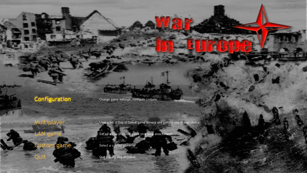
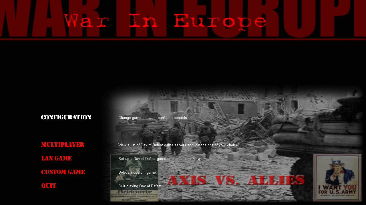
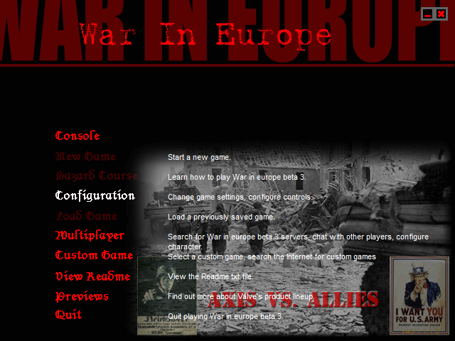
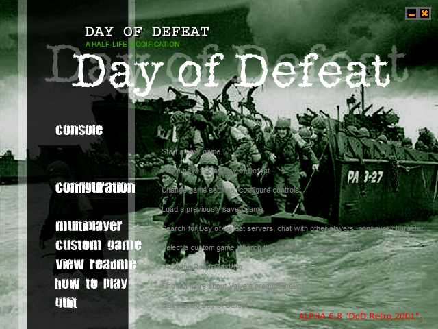
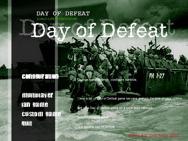
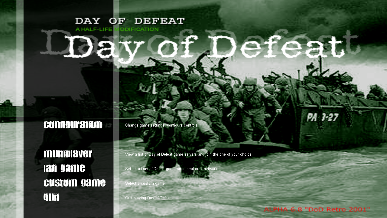
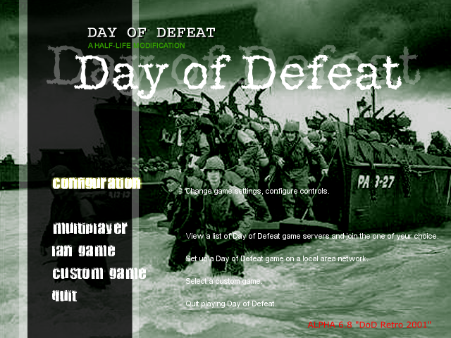
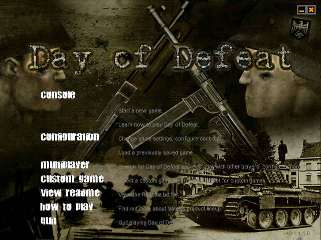
For example, images with plain background, smaller amount of details and without text are easier to upscale, than images with rich detalization, abstract textures and text, which was created by using specific, sometimes peculiar fonts with different shapes and amount of details.
sensei 黒いバラ  [author] 25 Nov, 2024 @ 6:40am 
Thank you for your positive feedback, I've found these fonts by using different font searching services.

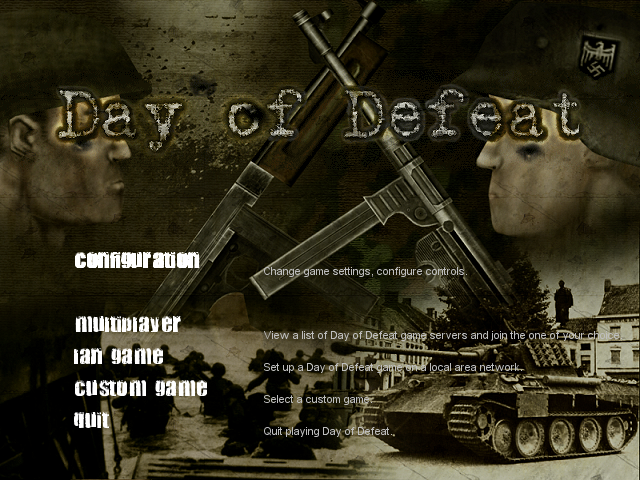
Regarding backgrounds, I actually would like to upscale them one day somehow without losing its original quality, colors and without creating any significant artifacts, but I don't have any extensive knowledge about image upscaling and I didn't work much in Photoshop, especially in newest versions.
Therefore, I will need to learn about all that stuff, find appropriate services and resources, then experiment by using method of trial and error, which, obviously, will take quite a lot of time.
Unfortunately, right now I don't have much of time and energy for learning something from scratch, so any guidance and recommedations will be appreciated.
OpenRift 23 Nov, 2024 @ 12:43pm 
You should try recreating some of these background graphics in widescreen if you can. I get the feeling you already know this, but I made my own versions of these a while back, and what I did was use AI outpainting to extend the original image to 16:9, then went over them in Photoshop a bunch to get them looking right.

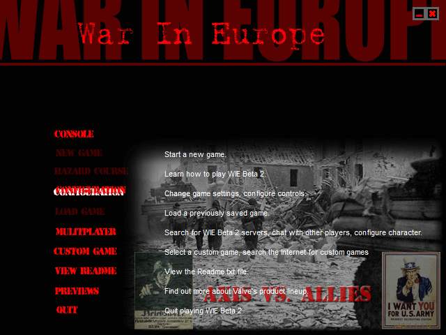
Regardless, great job on the fonts, how did you find some of these?? I looked everywhere for the Retail 1.0 font for this and for Ricochet, but to no avail.